Tutorial: The Financials view
The Financials view in ShareScope is made up of several Tabs. The tabs that are available change depending on the type of instrument you have selected in the list.
The tabs you have available are:
For Shares and Investment Trusts:
Summary - Company - Income - Balance - Cash - Ratios - Dividends - Brokers - Custom
For Funds:
For Gilts and Bonds:
The Summary Tab
The Summary tab, which is consistent across all of the instrument types is dynamic - showing different information depending on the instrument type selected.
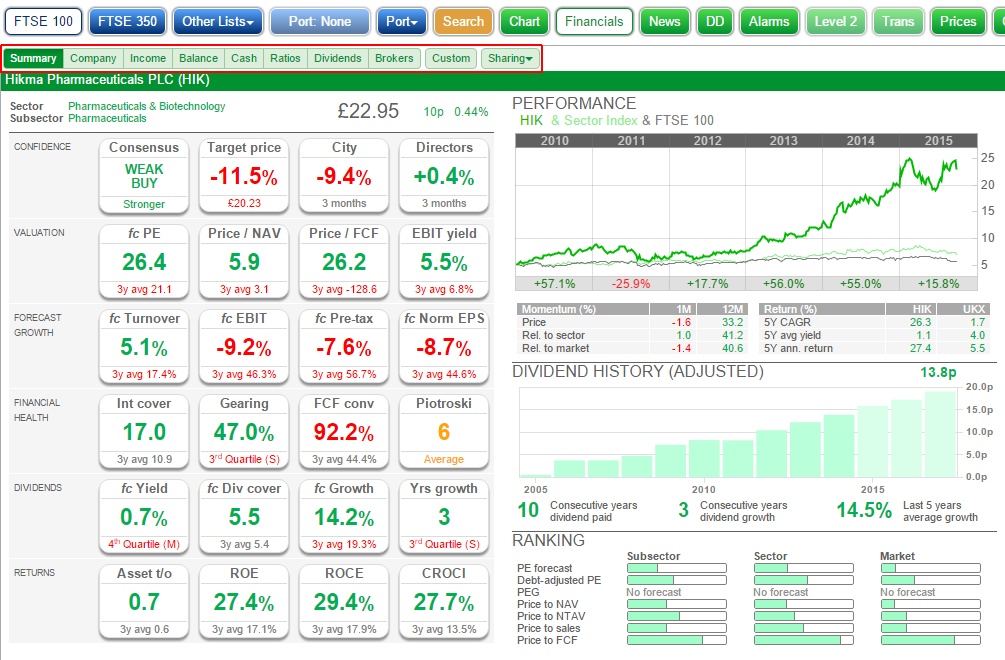
Shares

Here you can see the summary tab is displaying data for Hikma Pharmaceuticals (HIK) which is a share. On the left you can see the dashboard which is customisable, if you wish to know more about this have a look at the Using the Dashboard video tutorial. On the right you can see data pertaining to the share's Performance, Dividend History and sector Ranking. Note if you do not have enough screen width to display this information it will be moved below the dashboard and you will be able to scroll down the page to see it.
Investment Trusts
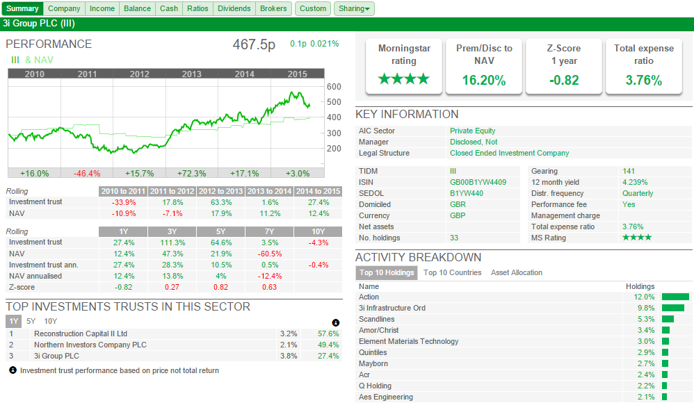
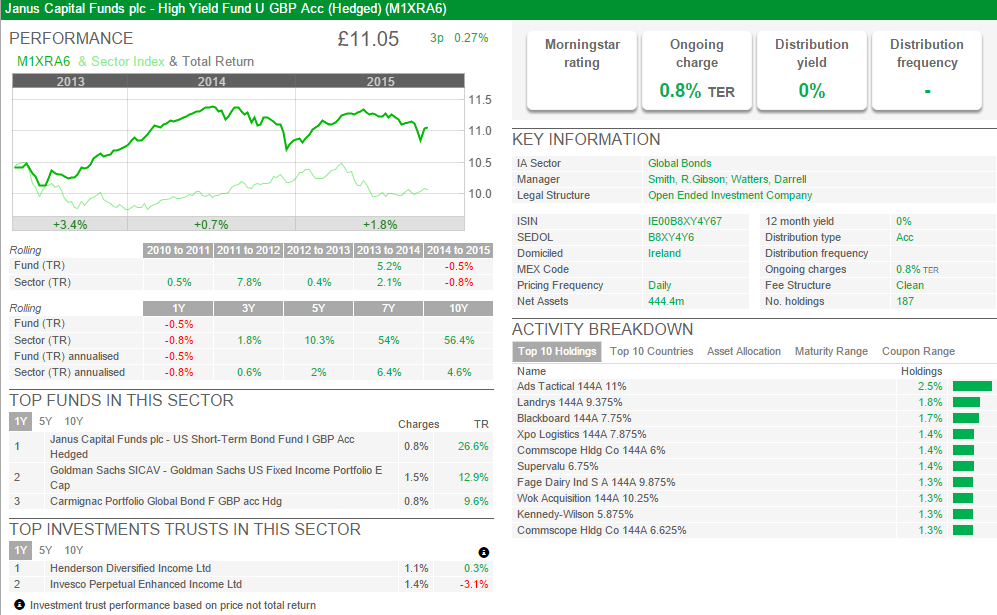
You can see that the data displayed on the Summary tab for Investment Trusts is very different to that for equities.
There is no dashboard. Instead the Performance data occupies the left hand side of the screen. This includes a comparison against the top performing Investment Trusts in the sector, and separately, the top performing funds if there is an equivalent IA sector.
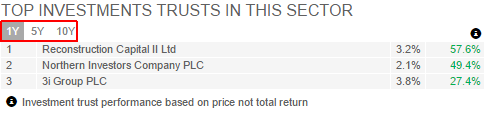
You are able to change this to display the performance over 1, 5 or 10 years.
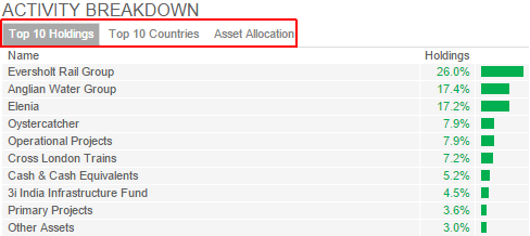
You can also change the Activity Breakdown so that it shows the Top 10 Holdings, Top 10 Countries or Asset Allocation.
Funds
The Fund Summary tab is much like the one shown for the Investment Trusts. However, there are a few differences.
The key metric boxes, shown here at the top right of the window, show different data items.
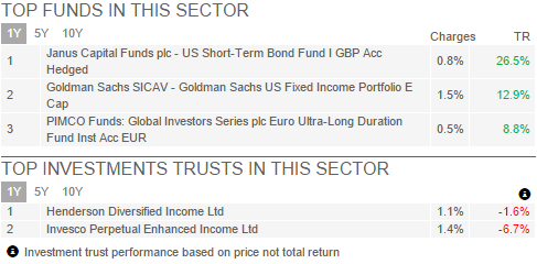
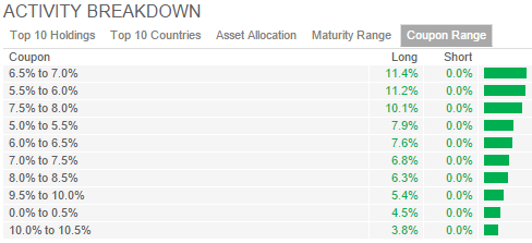
If the fund tracks a gilt or bond then, in addition to the Top 10 Holdings, Top 10 Countries and Asset Allocation, the Activity Breakdown will also include Maturity Range and Coupon Range for comparison.
Gilts and Bonds
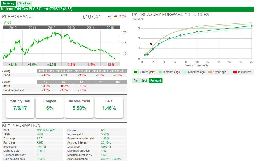
The Gilt and Bond Summary screen is similar to that of Unit Trust and Investment Trusts. However, it displays data that is relevant to Gilts and Bonds.
Data such as the Maturity Date, Income Yield, Dirty Price and Gross Redemption Yield (GRY) are shown as well as the UK Treasury Yield Curve which can be switched between Par, Spot and Forward calculation methods.
The Company Tab
Shares
The company tab, which is available for shares and investment trusts, is designed to provide you with further information about the company itself.
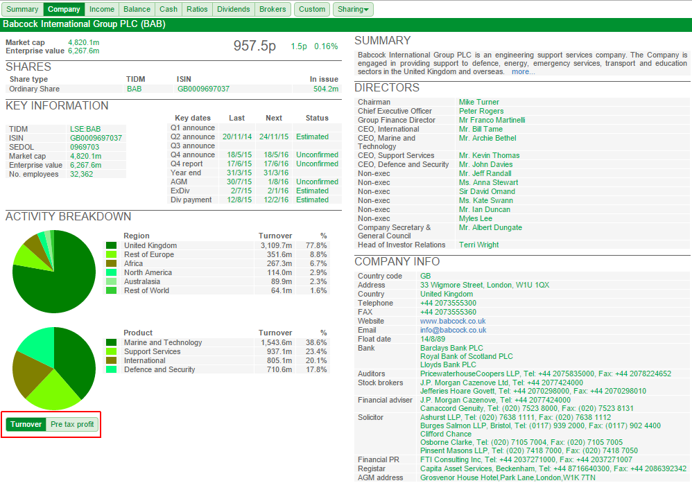
For shares you are given a breakdown of the company's reporting dates, a summary of the company's activities, a graphical breakdown of their activity, details of their directors and other general information about the company.
Note: You can change the metric via which the activity breakdown is measured from Turnover to Pre Tax Profit.
Investment Trusts

The investment trust version of the Company tab does not display the activity breakdown data. However, for investment trusts you can find this data on the Summary tab.
The Income Tab
The income tab is ShareScope's reconstruction of the company's Income statement. It contains metrics like Turnover, Post-tax Profit and EPS.
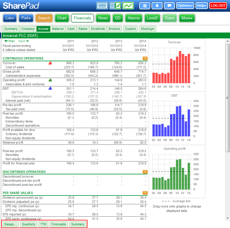
At the bottom of the Income tab you have several options:
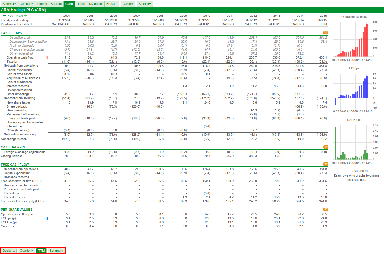
- Design - this lets you change the way negative numbers are displayed in the table.
- Quarterly - this shows quarterly rather than just year-end data in the table.
- TTM (Trailing Twelve Months) - this adds a column which shows the results calculated using data from the previous 12 months rather than the last financial period. Where the company's latest results are full year results, the TTM data will be the same.
- Forecasts - this shows up-to 3 years' of forecast data where available.
- Summary - this reduces the depth of the table so that only the main metrics are shown.
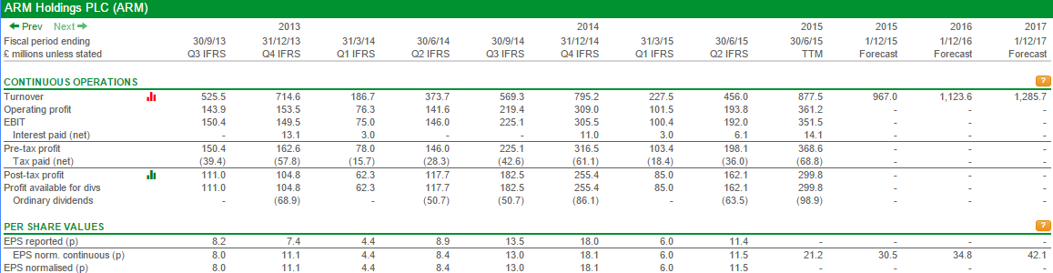
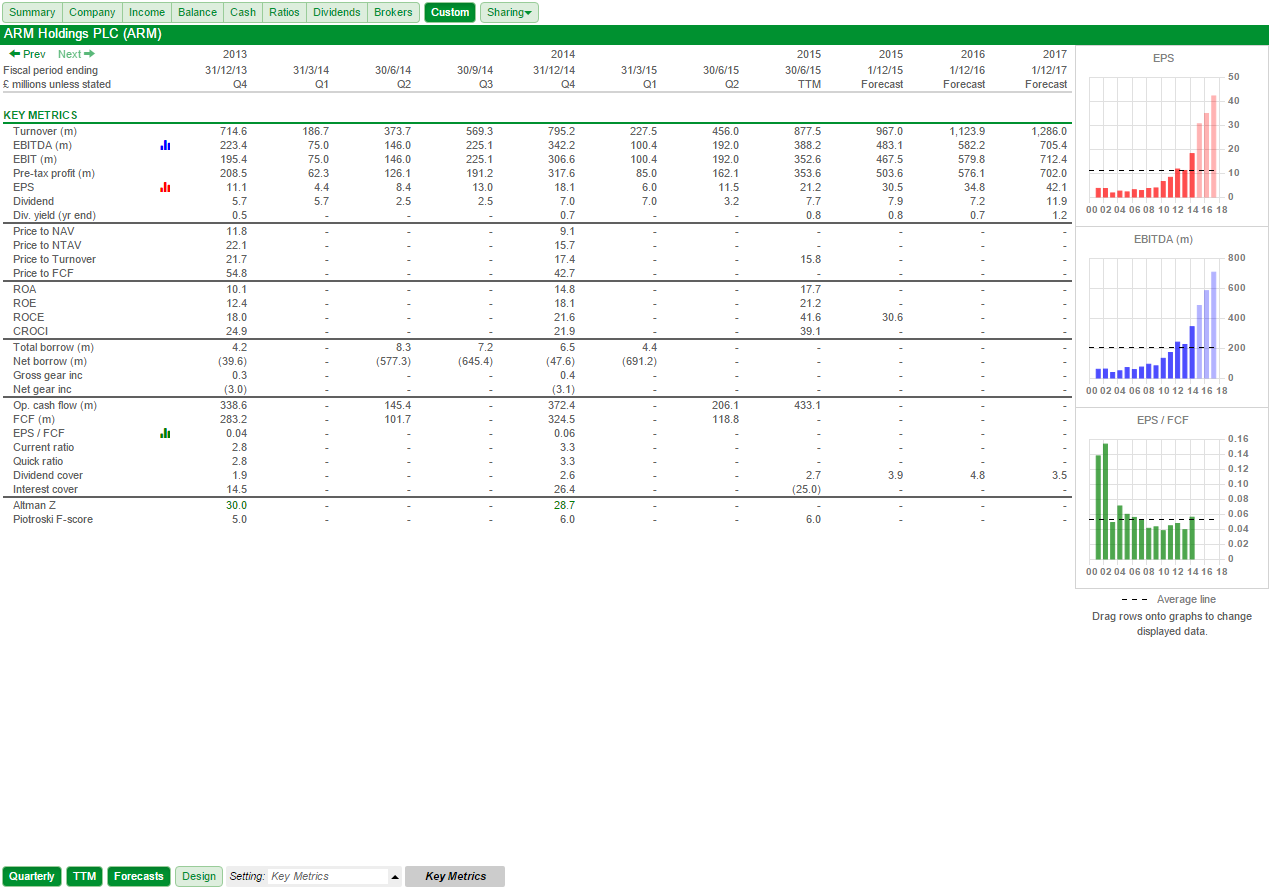
Here you can see Q1, Q2, Q3 and Q4 results for ARM, a TTM column after the Q2 30/6/15 results and also 3 years' forecast data. You can also see that Summary has been selected and the number of rows of data has been markedly reduced.
If the Quarterly, TTM, Forecasts or Summary options are selected then they will apply to all of the Financials tabs for which they are relevant.
There are three graphs on the right-hand side of the Income tab. These can be set to show data for any of the metrics listed in the table.
To change a graph you drag the metric's name over to the graph you want the metric displayed on.
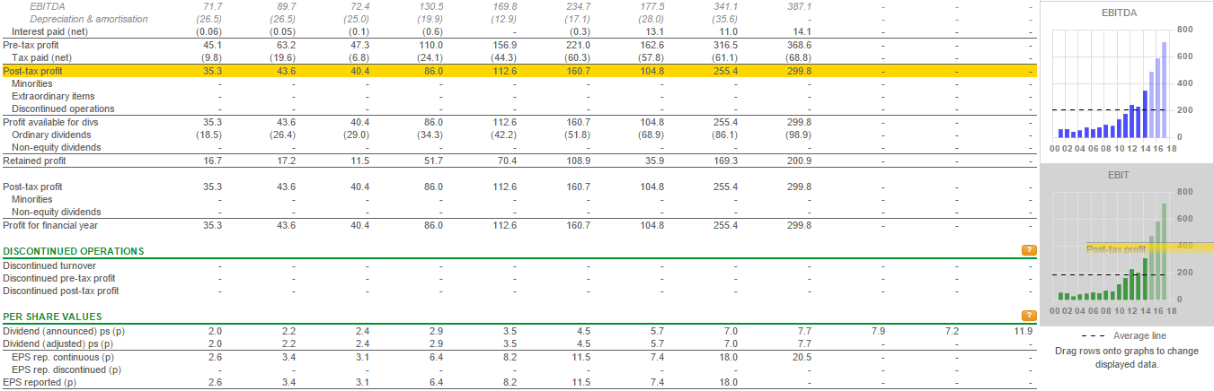
You can see that the row of the selected metric will turn yellow/orange as you start to drag it towards the graph. When you move the metric over the graph it will become grey-shaded. Release the metric and the graph will be changed.
A little coloured chart icon of the chart will also appear next to the name of the selected metric.
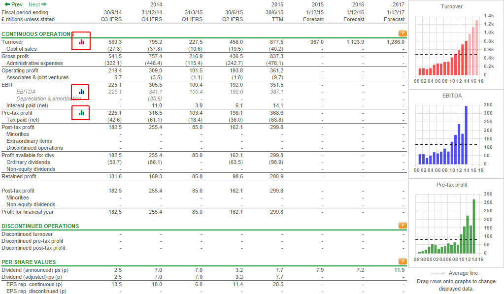
Each of the main headings in the Income tab table is accompanied by an orange help icon: ![]()
You can click on this icon to find more information regarding the metrics covered by that heading.

The Dividend Tab
The Dividend tab, which is available for shares, investment trusts and unit trusts, shows details of the dividends in both list and chart form.
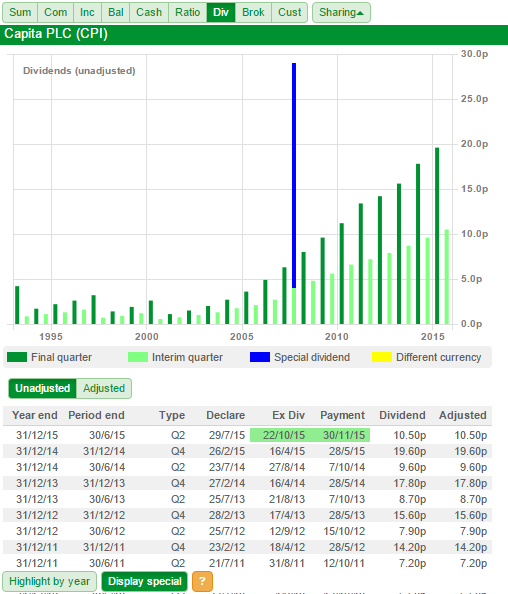
You can see that the most recent Ex Div and Payment dates are green. This is because the dividend has been declared but, at the time of writing, the share had yet to go ex-dividend.
The chart can be set to show the dividends either Unadjusted or Adjusted (for corporate actions).
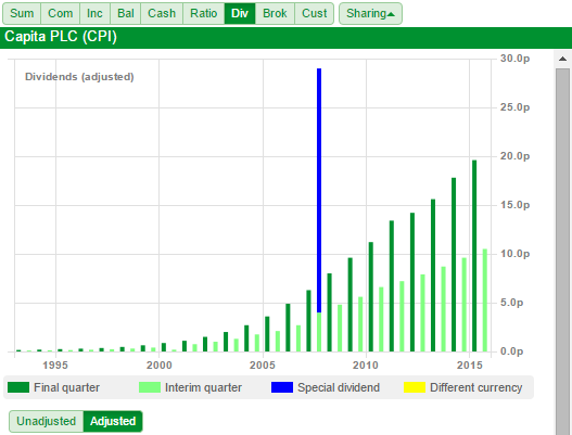
Showing the adjusted dividends on the chart, however, shows that there has in fact been a steady increase in the income Capita has returned to its shareholders over the last 20 years.
The standard setting for the dividend table is to highlight every other row. However, if you select the Highlight by year button the highlighting will be changed so that alternate years are highlighted instead of alternate rows.
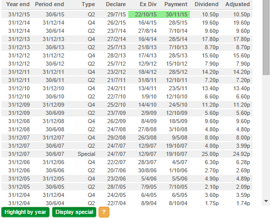
The Display special button toggles on and off the bars for special dividends on the chart.
The Dividend tab also has a more detailed help section that you can access via the orange question mark button which is situated on the bottom toolbar.
The Brokers tab
The Brokers tab shows details of the individual broker forecasts which are used to calculate the consensus forecast data in ShareScope.
Each Broker's forecast is dated and also accompanied by the date when the forecast was last confirmed.
The Consensus is a date weighted average, so more recent forecasts will be weighted more highly than older forecasts. In this example Canaccord will be given the lowest weight as the forecast is from 2014 whereas the other forecasts are more recent.
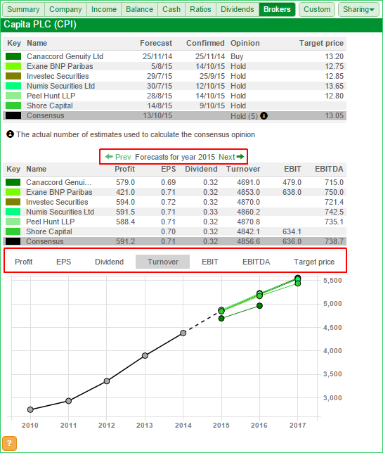
ShareScope contains forecast data that covers the next 3 years. It is possible to see this data by using the Next button to advance forward in time and the Back button to step back in time to the most recent forecast date.
The chart on the Forecast tab can be set to show data for any of the available forecast metrics; Profit, EPS, Dividend, Turnover, EBIT, EBITDA or Target Price.
The Fund tab
Funds come in different types:
- Unit Trusts
- OEICs (Open Ended Investment Company)
- SICAVs (Société d'Investissement à CApital Variable)
- FCPs (Fonds Commun de Placement)
Irrespective of type each fund often has a series of different class instruments associated with it.

The Fund tab provides you with a list of all the different classes instrument associated with that particular fund.
If you wish you can make a list of these funds by clicking on the green Make list button.
This creates a temporary list that will show on the blue side of ShareScope and will then enable you to look at further details for each of the different instruments.
It is also possible to click on one of the individual funds listed on the Fund tab.
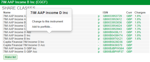
When you do so you are presented with a pop-up that gives you the choice:
- Change to this instrument
- Add to portfolio...
Change to this instrument creates a list with that instrument as the only constituent.
Add to portfolio... provides you with a list of your existing portfolios so that you can select the portfolio you wish to add the fund to.
If you click away from the pop-up it will close.
The Custom tab
The Custom tab allows you to create one or more financial tables containing just the data you are interested in. You can add any Financial or Ratio data item that you can also add as a column.
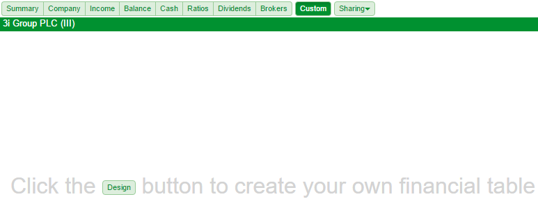
When you first enter the Custom tab you are prompted to click on the green Design button.
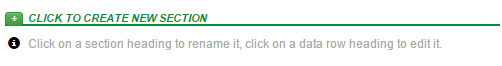
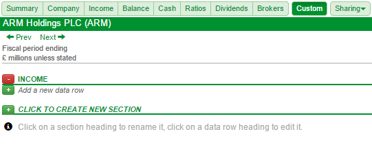
When you click on the Design button the screen changes to what looks like an empty replica of the Income view. The important part of this window is the green section titled: CLICK TO CREATE NEW SECTION:
When you click on this you will be prompted to give the New section a name. Here we have called the new section Income.
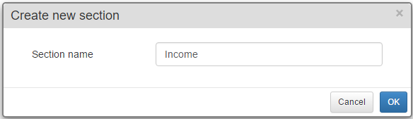
A section titled Income is then created.
The red minus icon ![]() deletes the section. If you do click on this by mistake you are asked if you wish to Undo that action.
deletes the section. If you do click on this by mistake you are asked if you wish to Undo that action.
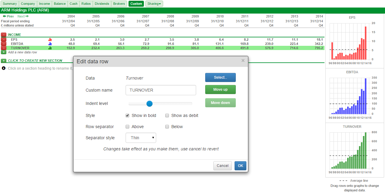
Clicking on the ![]() button beside Add a new data row opens a new dialog window.
button beside Add a new data row opens a new dialog window.
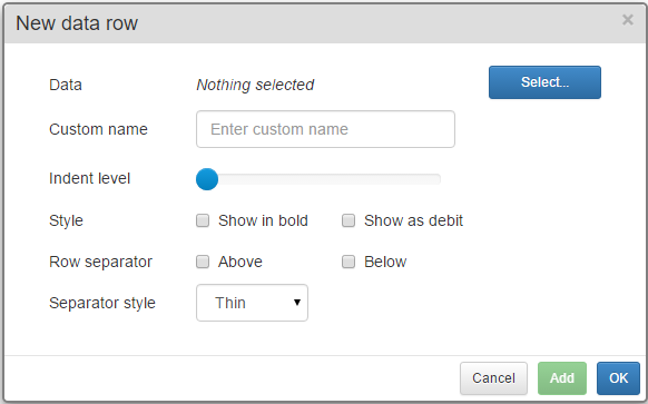
You can use the blue Select... button to select a data item. This opens a dialog page that is similar to the Add Column dialog and should be familiar to anyone that has used ShareScope for even a short time. If you want to know more about adding columns you can read the tutorial here.
You can input a custom name if you wish and select an indent level between 0 and 4. You can also choose to show the item in bold or as a debit.
In addition to the above you can also set the Separator to be Above and/or Below the item and for the line that is drawn to be Thin, Thick or Partial.
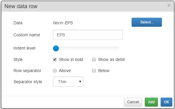
In this example we have chosen to add Normalised EPS to our custom financial table. The data item is called Norm EPS but we have added the custom name EPS and opted to make it bold.
Clicking on the green Add button will add the EPS metric to the table but will not close the dialog so you can continue to add more items to the table.
Clicking on the blue OK button adds EPS and closes the dialog.
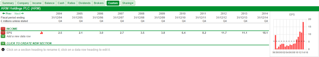
You can see here that we have added EPS to the table.
The ![]() button has appeared beside the EPS title. If you click on this the item will be deleted with no undo option.
button has appeared beside the EPS title. If you click on this the item will be deleted with no undo option.
The red bar chart on the right has also been automatically populated with the share's historical EPS data.
To edit the item click on the name of the item.
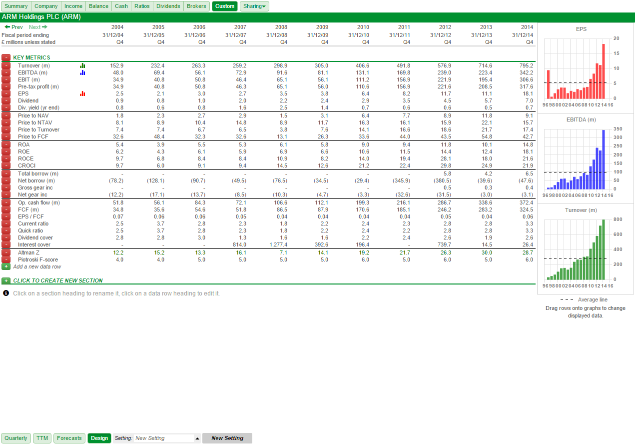
In this example we have added EPS, EBITDA and TURNOVER to the table and have decided to move TURNOVER up the list.
You can see on the Edit data row dialog there are green Move up and Move down buttons. In this case TURNOVER is at the bottom of the section so the Move down button is faded because it is inactive.
As three items have been added to the table all three charts have also been automatically populated.
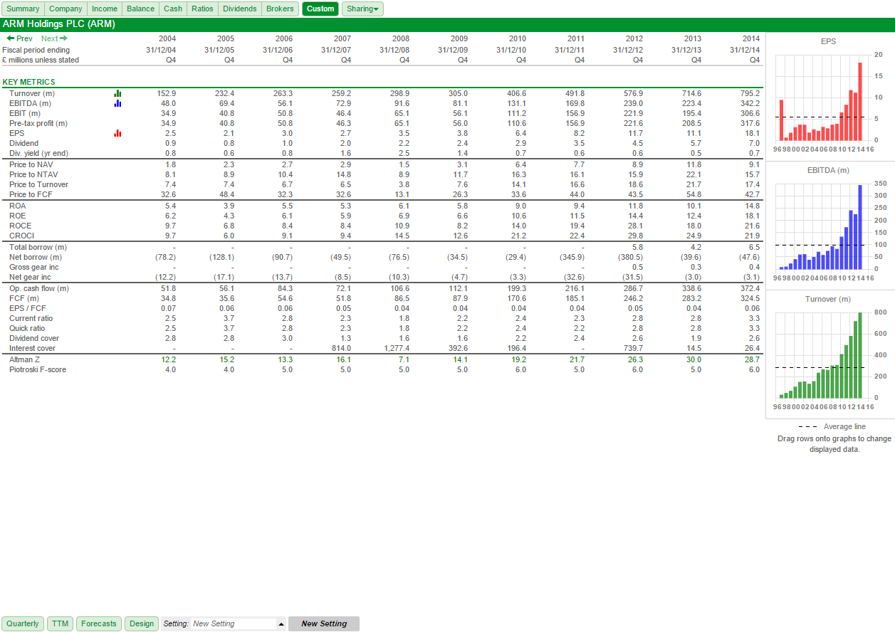
In the example below, we have added a whole series of metrics including the use of thick separator lines.
For the metric EPS/FCF we have used a combination column. You can find out more about combination columns here.
Once you have finished creating a custom setting, you need to click on the Design button again.
Here you can see the Design button at the bottom of the screen is no longer highlighted and all of the buttons used to edit the table have been removed.
This custom setting is now fixed. The metrics shown on the graphs can now be changed as per the instructions in the section covering the Income tab.
If you do wish to change the custom setting again all you need to do is select the Design button again.
You can have more than one custom setting.
At the bottom of the screen you may have noticed the Setting menu and the New setting button.
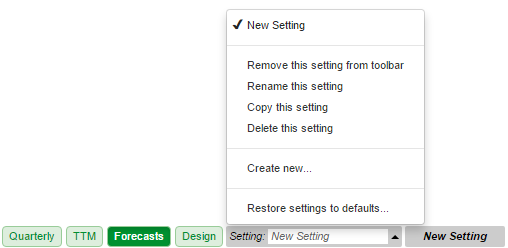
When you click on the Setting menu you are provided with a series of options:
- Remove this setting from toolbar / Add this setting to toolbar
- Rename this setting
- Copy this setting
- Delete this setting
- Create new...
Individual settings can be added as buttons to the toolbar. You can see that this setting has already had a button placed on the toolbar, it is the grey New Setting button to the right of the setting menu.
If the setting has a button then it can be removed from the toolbar. If it does not have a button then one can be added. The menu option will be displayed as appropriate.
Rename this setting lets you change the name of the setting. This will also change the name of the button if one has been added to the toolbar for that setting.
Copy this setting allows you to copy a setting. This is useful if you want to edit a table without starting from scratch.
Delete this setting will delete the current setting. This does not have an undo option so only choose this option if you are certain you wish to delete the current setting.
Create new... creates a new custom setting for you to start working on.
Finally if you select the Quarterly, TTM and/or Forecast options you should note that values will only be shown for those metrics that have data for those fields.