Alpesh Patel: How to use my technical Radars
Alpesh Patel's Momentum Radar
This radar is for people who want to analyse stocks the way I do. It is the radar I use most often. Not only do I use the Momentum Radar to analyse the opportunities found by my filters but I may scan through any list of stocks looking at their charts with this radar. Out of every 100 stocks I examine like this, usually only a few will have a sufficient clear signal and risk/reward profile.
This radar uses MACD, Stochastic, RSI and Bollinger Bands. You can read more about these indicators in ShareScope's Help. This radar also uses daily OHLC bars which you can easily switch to weekly and monthly bars.
The primary indicator is the MACD which can highlight divergences. Divergence often comes before a reversal in price direction (see below).
I use the MACD to confirm my view of a stock and I use the Stochastic and RSI to support the MACD. I have also found that when the Bollinger Bands (the green lines on the chart) are constricted like a bottleneck, this can indicate a sharp price move is about to happen. The more supporting signals you can find, the stronger the opportunity.
Bullish Divergence
For bullish momentum, the price is making lower lows but the MACD has made a higher low. See the illustration below:
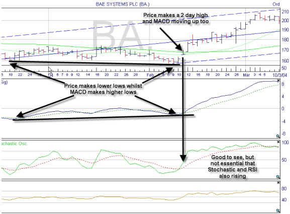
In this example, the stochastic and RSI are also exhibiting divergence. This is good to see but not essential. I always check the company news (press \ on your keyboard) to ensure there is nothing negative and ideally recent comment is positive.
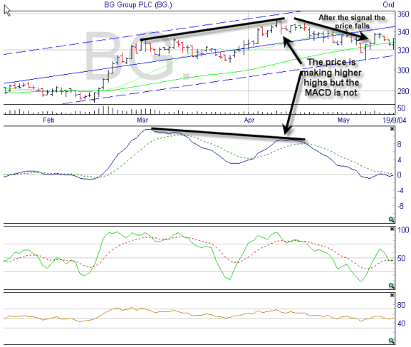
Bearish Divergence
Bearish divergence is when the price makes higher highs but the MACD makes lower highs. This signal is suitable for shorting.
Alpesh Patel's Market Breadth Radar
I don't use this radar very often but it can give you a feel for how the broader market is performing. In a buoyant market most shares rise and in a falling market there is downward pressure. I am loathe to be very bullish on any one particular stock if the overall market is weak.
NOTE: This radar is only suitable for analysing UK equities as the indicators are calculated relative to the FTSE 100.
The New Highs-New Lows (NH-NL) market graph looks at the difference between how many shares are at a price high and those that are at a price low. If the line is above 0 then there are more shares making new highs than there are making new lows. If the line is ascending than this gap is increasing. This is a bullish sign. If the line is descending, this is a bearish sign.
New highs-New lows can be a lead indicator sometimes for laggard stocks (those lagging their sector index) - i.e. if the New Highs-Lows indicator rises then individual laggard stocks can soon follow suit.
STIX and Overbought/Oversold you can read in the same way as New Highs-New Lows ? a rising line is bullish in the short-term and a falling line is bearish. Look also at historical values for both indicators to gauge how relatively overbought or oversold the share is.
I examine the Correlation to the FTSE 100 indicator because I want to ensure that the stock is not so highly correlated to the FTSE 100 that I may as well have an index tracker. I look for a value below 0.7.
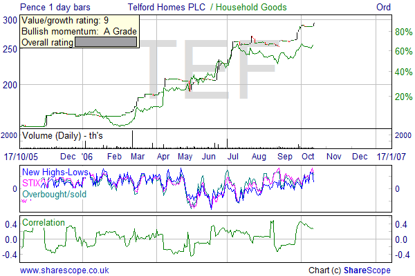
NOTE: The scale on the indicator windows ONLY relates to the first indicator displayed e.g. New Highs-Lows. You just need to look at the direction of the trend rather than the value.
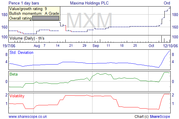
Alpesh Patel's Volatility Radar
Volatility makes for profit. As prices rise or fall we have the opportunity to make money. Equally volatility can give rise to risk and loss. Consequently I have chosen the various volatility indicators I use with great care over a number of years.
These indicators are used in different circumstances to get a better picture of the stocks that I am interested in and a better understanding of what I may be letting myself in for. There are no hard and fast rules - these are just parts of the bigger picture.
The Standard Deviation tells me how far the price is moving from its average (the average as measured over my proprietary outlook period). In general terms, if the standard deviation figure is relatively high to what it has been in the recent past then it can suggest the price is about to retrace and resume to a level it has recently traded at over the past couple of weeks.
Equally, if I was looking at a short-term fortnight trade and the standard deviation is near a relative low, then I have the indication that it may well be about to move upwards.
Good example of above: high standard deviation after a sharp rise suggests a period of calm and not much share price move.
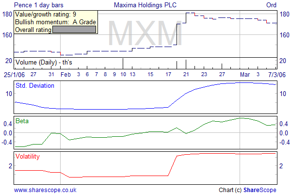
In the above graph, the standard deviation had reached a relative low before the price rises sharply.
The Beta is another measure of volatility of the stock, but this time compares it to the market as a whole. I look at this to get a feel of how much more risk (volatility) this stock may be giving me relative to the rest of the market. The beta of a share is a measure of the degree to which it is expected to rise and fall in proportion with the rise and fall of an index (by default the FTSE 100 is used for the index). If the number is greater than one then, on past performance, it is expected to go up faster than the index when the index is going up and go down faster when the index is going down. If the beta is relatively low then it indicates that the share price is largely independent of the movement of the index. So in a bull market, high beta shares can be expected to rise more quickly than the index - and in a bear market they can fall more quickly.
The Volatility indicator is there for a similar reason. The volatility indicator measures the degree of movement, up or down, of a share price. The more rapid the movement, the greater the volatility. Higher volatility is generally believed to indicate higher risk. An ideal share has high growth with low volatility.
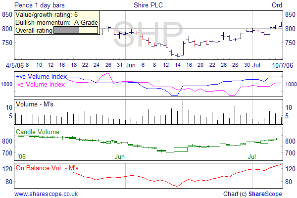
Alpesh Patel's Volume Radar
I don't put too much emphasis on volume but I sometimes use this radar to seek supporting signals.
First up are the Positive and Negative volume indices. The positive volume index focuses on days where the volume has significantly increased from the previous day's trading. It tries to determine what smart investors are doing. When trading volume is high it is thought that inexperienced investors are involved. Whereas on slow days, "shrewd investors" quietly buy or sell the stock.
When the positive and negative volume lines cross each other that can often signify the start of a new trend in my experience. See the example below.
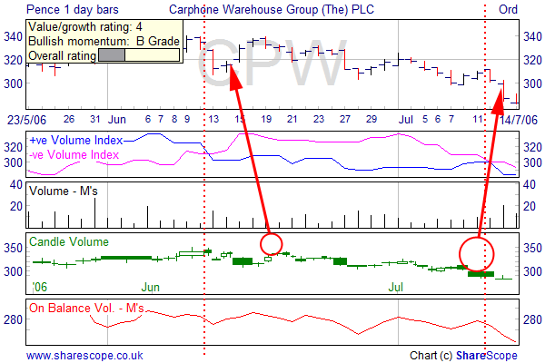
The Candle volume chart shows me Japanese Candlesticks but sized according to the volume traded. This means that the candles are not necessarily in line with the date axis. A price move made up on more volume suggests the move has more legs. A move on shallow volume would suggest the move may lack strength and one should not read too much into it. On the chart above the downturn on July 13th is made on significantly greater volume than the upwards move on the June 14th.
You shouldn't put too much weight on such readings as sometimes high volume means everyone who wants to buy or sell has done so and the trend is about to change.
The key is to look for large volume and appreciate that it means a sizeable move may still be in the offing.
On Balance Volume is a favourite with many volume followers. It is actually a momentum measure. Granville, the creator of this indicator in 1963, went on to explain his theory by stating that when volume increased or decreased dramatically without any corresponding change in the issue's price, then at some point the price would "spring" upward or downward. The idea is that smart money is buying from retail investors whilst the price is still fairly static and that it will subsequently therefore rebound.